Little Columbus is a preschool by Grand Columbus International School to initiate the concept of more robust roots. Little Columbus brand exists in Faridabad in the vicinity of Grand Columbus International School but was owned by a different owner. Later, the authority of Little Columbus was under the same ownership. The ground floor is dedicated to the Little Columbus which may or may not persist in the future inside the premises. The existing preschool was clubbed into Little Columbus.
Little Columbus
Through our efforts and strong branding, Grand Columbus became a steadfast brand with branding at its peak as compared to it Little Columbus stood nowhere and needed branding at the utmost. Little Columbus had to match the aura of Grand Columbus in terms of a brand. As for big schools preschool work as a feeder as the preschoolers eventually end up enrolling in senior school. To accomplish this required branding of Little Columbus. So on our way to this goal, we faced challenges they are
- Within a year after the rebranding of Grand Columbus International School, we had the work of Little Columbus. Already there was enough resource being used up. Therefore, our client asked to do us good work with the existing limited resources.
- When marketing strategies were completely planned our corps faced another challenge which is the pandemic as we were not able to execute our planned test of branding. This was entirely an extremely hard phase for our society as a whole.
Diverse discourses led to the following solutions:
- As we look into the brand personality of Grand Columbus International school its target audience and business motto are quite dissimilar from Little Columbus. When we talk about Grand Columbus the expectations are in terms of academic excellence but when it comes to a preschool like Little Columbus the parents and the guardians of a preschooler expect it to be more of a safe and secure environment along with a premium infrastructure. In order to fulfill these needs our creative associates addressed a design that perpetuated the appearance of softness and smoothness in itself. The designs included shapes with rounded corners, color choices were from the cool color palette, soft, and had a pinch of warm color that is orange in order to sustain the contrast.
- We continued the design approach, 3-4% was occupied by the color orange, and the rest was taken over by blue color. We went for a smiley face in the logo design to impart a fun, loving, joyous, and jolly environment. Approximately 9 out of 10 preschools use a bundle of colors in their designs for example little millennium, petals, little pebbles, etc which divert them from their actual means and is quite confusing, and registering also becomes a quite difficult process. About the font, keeping prerequisites in mind we opted for a playful and friendly font.
- Worked on the website of Little Columbus and built it in such a way as to convey a gentle and mellow outlook. Forwarded three points after rounds of mere research and deep analysis of resources, to inculcate in their school website to enhance their school values:
- Home away from home: To set forth that Little Columbus provides a secure and safe ambiance.
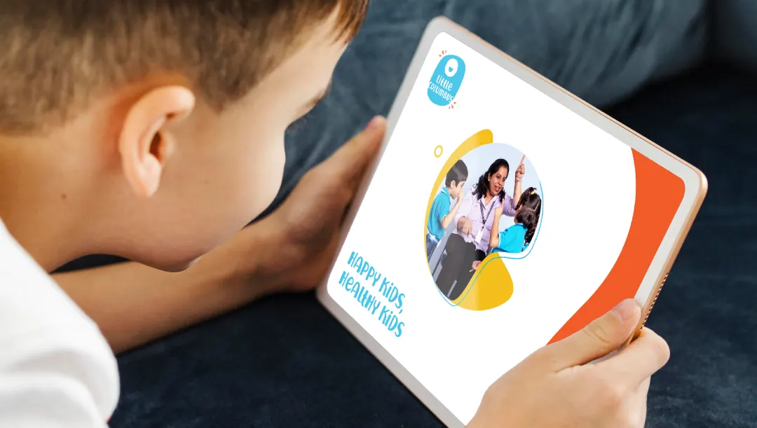
- Healthy Kids, Happy Kids: Little Columbus includes a kid’s gym on its premises which is an idea unique in its arena as many preschools merely focus on academics rather than health. Therefore, this statement correctly put forward their value of health being the primary.
- Life skills: As with the new era, modernity requires the imbibition of life skills to lead a happy and successful life. Inculcating this in the website creates a sense of attractiveness for the target audience.
- To be more effective and economically feasible, rather than opting for offline marketing campaigns, we went for online marketing campaigns which were a low-cost option and comparatively an impactful one in the post-lockdown period. We didn’t go for print media to cut on costs.
- Mapped towards a more innovative and creative way of making Little Columbus a strong brand and took the leverage of the Grand Columbus International School. Associated Little Columbus with Grand Columbus and created touchpoints. Our squad worked on stationary materials such as the prospectus, almanacs, registration forms, etc, and made them even more illustrative and elaborative for the audience.
- Our team also did the space designing of the Lego Robo Lab and gave it a cheerful and merry appearance so as to match the vibe of the munchkins.
Lockdown was the reason we were not able to observe the instant or you can say immediate impactful results. We sensibly decided to bide our time. After the reopening, the results were noticed as there was a keen increase in enrollments and counselors started to get more and more queries. Gradually, the preschool perceived a good and splendid response from the audience. Eventually, leading Little Columbus became a strong brand and not requiring the shadow of Grand Columbus International School. Maybe in the near future, it will be an individual infrastructure outside the Grand Columbus.
