The school was established in the year 1990. Formerly, Jhankar Sr. Secondary School, which was established by the In-laws of Moksha Yadav (Director). The location of the school is countryside in between rural and urban areas. However, it is just approx 800 meters inside the Delhi-Jaipur Highway, NH48. When Saarthi met MIS there were 600+ students studying. It’s been more than three decades since the school has given values and virtues along with education. Also, it believes in the spiritual growth of our students in this modern world. Simple techniques to keep themselves stable are what they learn and consequently, our students feel free from all the stress and stay happy.
THE MOKSH INTERNATIONAL SCHOOL
- Sec-78, Gurgaon
- Started in 1992
- There are two major tasks that were of the utmost importance, Naming and Branding. In 1990, Jhankar Sr. Secondary School was part of a rural area, but as the development took place with the construction of high-rise buildings and settlements in those apartments, the location improved. As time changed, so the people also changed around the school locality. Now, when things are changing, the name Jhankar does not stay convincing to this new audience. There we got the chance to rename and rebrand the school as per the tastes and preferences of the parents and students around. This new name and brand sprouted the opportunity of a new logo that aligns perfectly with the vision and mission of this new generation torchbearer. She is highly inclined towards spirituality and understands the value of good mental and emotional health. So, she wanted the name and brand to precisely and crystal clearly reflect her vision and mission, this was her expectations and so was ours.
- Now the second task was to put the whole lengthy name together as a logo. So, the challenge was to fit the name design wise that it looks aesthetic yet makes sense to everyone.
- It was very crucial to do the branding of the school as per the target audience’s tastes, needs, and preferences. The director of the school wanted the same that the branding should feel and look according to the audience.
- We collaborated with the esteemed director of the institution, Moksha Yadav, collectively embarking on the significant task of choosing a name for their school. The director's visionary leadership and the collective wisdom of our school saarthi played a pivotal role in this important decision-making process. With open hearts and minds, we brainstormed, discussed, and considered a myriad of possibilities, ensuring that the chosen name would not just be a label but a representation of her values, aspirations, and the unique identity of the school. We shortlisted a few names like St. Mary, St. Peter, Scottish Academy, etc. that were believed to smoothly fit the target audience’s expectations and showcased the convent school essence as well. However, these were not sufficient, the director wanted a name that aligned with spirituality, and then we came up with names like Nirvana International School, Adhyatmik International School, and many more names. Suddenly, we realised that her name is Moksha, which itself is connected to spirituality. From here, The Moksh International School name was driven. It was a harmonious fusion of expertise and passion, resulting in a name that embodies our commitment to educational excellence.
- Our client vouched for the design of an eagle in the logo, even though the design looked captivating, there was a scarcity of an emotional connection between the name, brand, design, and vision. Saarthi was unquestionably seeing the other side, where this logo design could make the target audience sceptical and they could take the message the other way. So, when our team was not convinced about it, we looked for more suggestions and options.
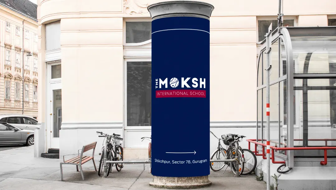
Then, Saarthi team moved ahead with the logo that we first sketched on our drawing board, only striving to add elements of astrology, yogic spirituality, and celestial bodies. Our team of ingenious designers through sketches explored design ideas pertaining to spirituality. Our visual treatment of the logo oozes nothing but the spiritual side of the universe, which shows celestial body elements that are highly convincing. The focus must be on MOKSH, for which the team gave celestial body texture to it.
- The fonts and colours, have their own essence, aura, and personality that make it suitable for a specific design. For this reason, our team decided to pick professional, corporate fonts that have a stable base and straight lines, clearly radiating professionalism. Similarly, the colours which we use have a distinctive personality. Blue has a reliable and corporate personality whereas the contrasting colour of blue that is red we used, is a warm colour and has a loud personality. For that cause, only 20-30% red was poured into the logo, which went really well and subtly.
- The name of the school was a lengthy one, for which a creative solution was much needed. So, rotating ‘THE’ made a pretty good space to highlight MOKSH and make it loud and clearly visible. But, now we have to align it perfectly with the most lengthy word of the logo which is ‘International’ so that the logo gives a sense of balance. Therefore, we increased the size of MOKSH above International. As a result, the logo came out to be visibly balanced and technically aligned.
- The process was a testament to our school's collaborative spirit and the shared dedication of all stakeholders toward building the brand of the school.
