BukMuk is an online library that delivers real physical books to your doorstep, holds live events, and also comes up with really good book recommendations for kids. They were previously a franchise of “I Love Read” and from there took the concept and inspiration and started this brand “BukMuk”. At first, they were supplying books to Delhi NCR but now they are supplying books in PAN India. During the pandemic, coming up with such an idea was mindful work. They dispense a variety of over 20000+ books all over India. They offer subscription plans starting from Rupees 899 to Rupees 8499. “BukMuk” is a venture partner of “KukDuKoo”(our previous client). Looking at the work we did for “KukDuKoo” they were highly impressed and wanted us to work for them too.
BUKMUK
- The first and foremost challenge was to suggest a name that is suitable for a kid-based website.
- Secondly, they wanted to create a logo and brand identity for the brand. The client required a mascot for their brand. The mascot they desired was a monster. This was a challenge as monsters are not generally associated with kids' domain as monsters are the symbol of darkness and evil. If we had a mascot it became crucial that we limit ourselves to wordmarks because we cannot keep 3-4 identities in one brand as it results in a puzzled audience that to which brand identity they should relate.
- Also, after witnessing and experiencing our work with “KukDuKoo”, and being a founder member they had high expectations from Team Saarthi.
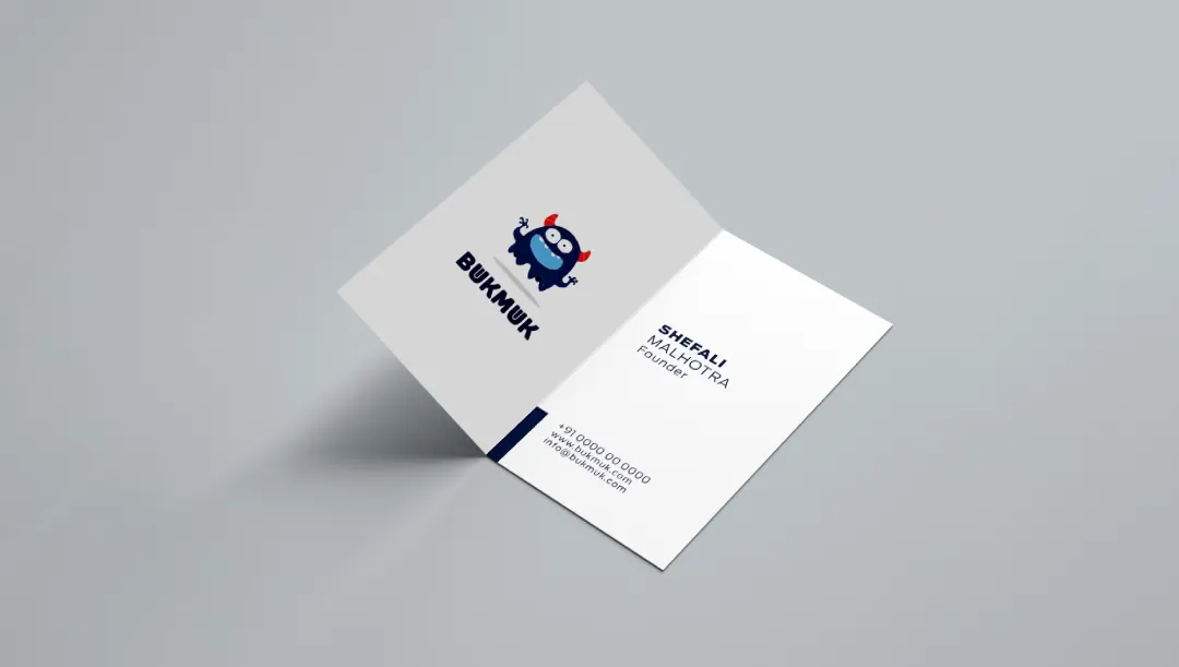
- During our consultations, the client picked up the name “BukMuk”. We had to limit ourselves in the wordmark as they previously fronted their need to have a mascot. Our creative associates explored and presented a few options. Explorations led to vigorous work on sketches. Several ideas were discussed, a filtering process took place, and we forwarded a few options. Finalized to use ‘u’ in the “BukMuk” as a book purposefully to convey the ideology of the brand.
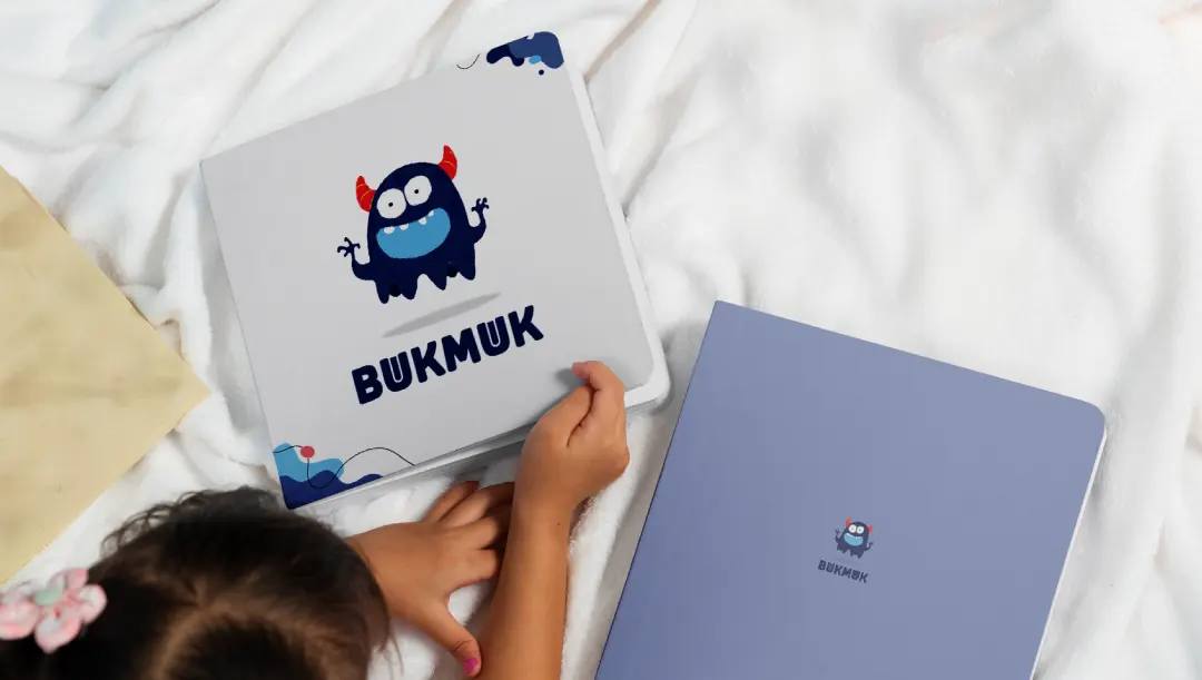
- Now was the turn of the mascot which was ought to be a monster. We made efforts in terms of the looks of the monster so that it is not a scary one but cute, adorable, and relatable to kids. So, our associates designed it in such a way that it does not represent an evil, scary and dark one. Initially, the monster sketches we made had a scary look but later on with time after further explorations came up with a cute and adorable monster that does not comprise any kind of sharpness even the teeth were rounded to strike out sharpness which improvised more of detachment and evil. Before even hitting the sketchbook we had in mind to keep the monster two and a half heads and improvised while building the monster.
- Regarding the color scheme, we chose the colors dark blue and orange which are complementary colors. As the monster was the mascot we went to opt for dark blue to transmit the idea of darkness and night. Also, the color approach was kept patchy to suggest a handmade look. This way we tackled the various challenges.
For testing purposes, we showed our mascot the cute little monster to kids aged 3-6 years and it was warmly welcomed and accepted by them. They found it friendly with whom they could interact and interrelate. Our clients even appreciated and found the monster adorable and toddler-friendly. They felt contented and were satisfied and till now for branding, they switched between the wordmark and the mascot. They even highly appreciated the color scheme.
