Bridge Education is a Faridabad-based initiative of the Rawal Educational and Welfare Society. The whole initiative is to connect schools with competent teaching and administrative staff. Bridge specifically recruits educators in the Delhi-NCR region, Faridabad, Gurgaon, and Noida. Its process includes recruiting educators from various institutions that provide degrees in the field of Education. One of its kind is Rise Max College of Education, Faridabad. Moreover, the society has 3 more educational institutes, Rawal International School, Rawal Convent School, and Rawal College of Education.
They have faced similar challenges, where they couldn't find competent educators for their institutes because of this, Mr. Anil Rawal decided to introduce Bridge Education in the market to troubleshoot this challenge for their own schools as well as schools in the region.
Whenever a client limits us from exploring design options by restricting us to a particular shape or any specific way of putting colours, they escalate our challenges, which eventually leads to restrictions on our team’s creativity. However, Saarthi has a history of seamlessly handling all these kinds of challenges. So, we have always come up with ideas the same way the sun shines after rain. Check out the creative ideas that we turned into innovative designs for our clients Bukmuk and Realcoderz.
Although Bridge Education already had its logo which contained a real image of leaves. A photograph that our client was using as a logo. But when it comes to us, we suggested them to have a properly designed logo that could align with their vision and mission as well as help Bridge Education to establish itself as a brand in the market. They made it very clear that the logo must contain leaves and should hold the vibrancy that their previous logo had, this felt like a block to our team’s creativity and suppressed the designer’s motivation because a designer is someone who provides design solutions. Therefore, they must be freed from all kinds of design-related limitations on the client’s end.
Saarthi was absolutely fine with the decision to keep leaves in the design, but our team wanted to explore more options in the range. Moreover, the client wanted us to go with the vibrancy that the previous logo had. Keeping it vibrant is no sort of an issue but the challenge was something else, which we discussed with them that the more colours we use the more it will be difficult to establish the brand. In other words, it becomes problematic to establish a brand with lots of colours. Also, this approach is overtly used in children's domain. However, Google is an exception that has vibrancy and still it is able to establish its brand identity.
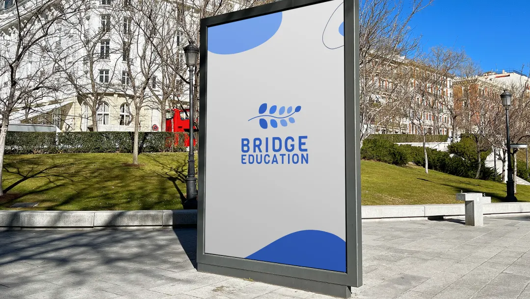
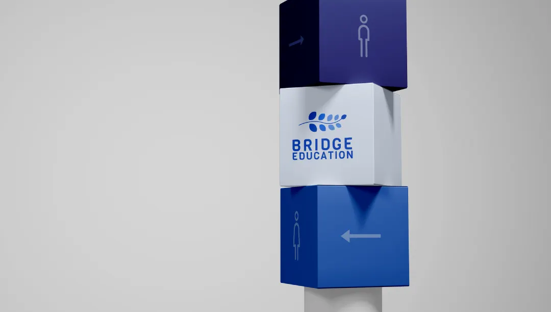
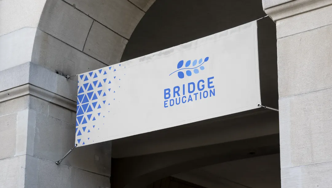
So, our team came up with a solution that we discussed with Mr. Anil Rawal as well and he found it well, we decided to not keep variables in colours, but to opt for shades and hues of one particular colour. So, he gave us the liberty on how we would like to treat the logo colour-wise. From there we worked and showed up with several options out of which, this is the final which was picked up. We kept the leaves minimal and picked sky blue with its gradient, range, and shades.
Without any grain of doubt, our client was absolutely happy that we kept his expectations and aspirations intact. The decision to keep the font a bit curvy to give contrast to the whole design came out really attractive as we gave it a human touch. It happened only because our team decided not to use the corporate fonts because every school and brand demands a unique solution to its unique challenges.
The client was extremely contented and satisfied with the work that they gave us the contract for the UI/UX design of the Bridge Education website.


