Sportyze is India’s first and fastest-growing chain of kids' gyms cum preschools as mentioned on their website, based out of Indirapuram, Ghaziabad. A suburb of Delhi, in the region of Delhi-NCR, India. It is conceptualized and managed by Acenati Sportyze India Pvt. Ltd. The preschool along with the kid’s gym was originally founded by Ms. Richa Mamgain Pant, Mr. Ankur Chowdhary, and Ms. Arundhati Chowdhary. The founders previously were enrolled in the corporate world but left it to create this venture. The preschool focuses on strengthening the student base and making sure that the preschoolers get enough training hours. Sportyze provides several services, including a kid’s gym, infant care, daycare, summer camps, etc.
The core idea of this preschool is to prioritize physical development and education. This idea was relatively a unique one as compared to previously established kindergarten as earlier, education over physical development was preferred and had a monotonous pattern.
They even converted one floor into serious gymnastics to uphold their idea. With great emphasis on physical development, they have won accolades at the district and state levels.
Team Sportyze was swayed by Saarthi’s work at KukDuKoo Lit Fest and met our associates. They approached us to know more about school branding as their motto was purely adhered to increasing their branding. After rounds of observations and brand auditing, we concluded the below-mentioned challenges that they were facing:
- Sportyze’s name itself does not give the idea that it is for kids. Moreover, it creates an impression as if it is for grown-ups or adults.
- Their visual identity which includes the font choices was more inclined to technology, which hinted at a corporate touch rather than an institution for kids.
- In the absence of the brand custodians, the impression of the institution went simply wrong as when clients had a look at the brand visuals it suggested a brand for grown-ups so the representatives had to elaborate then only their clients were able to grasp their thoughts.
We as a creative team felt that Sportyze's motto and values had a uniqueness in its category as an institution for kids but this uniqueness had its own set of challenges. So to tackle the above-mentioned challenges we came up with a number of suggestions. Here are the solutions that were suggested by our team Saarthi:
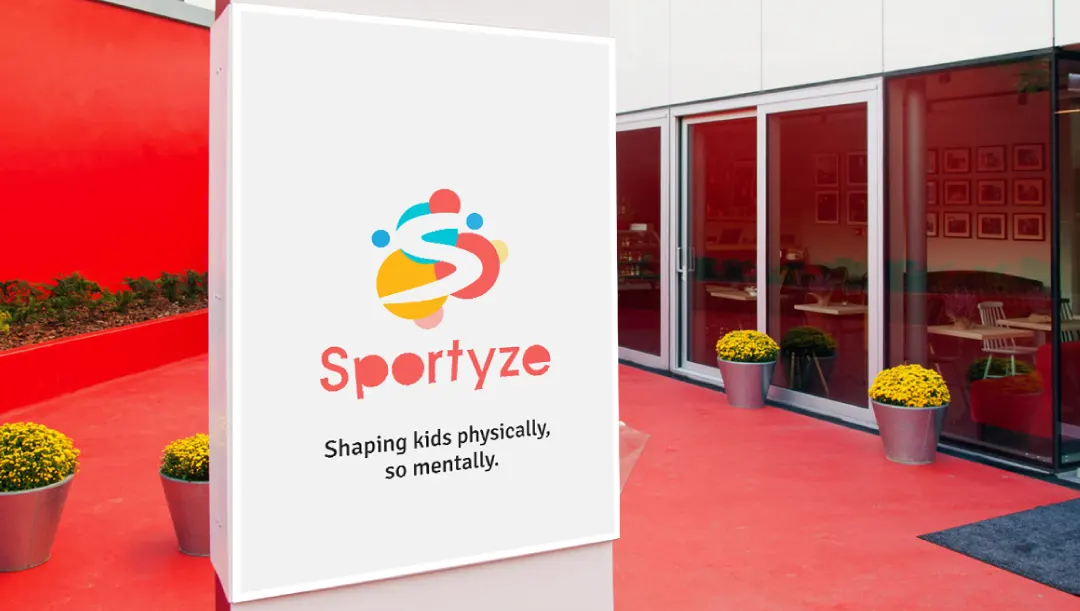
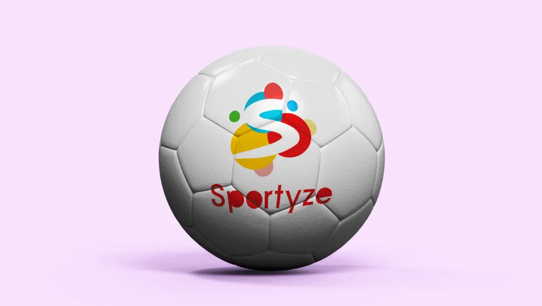
- The first and foremost suggestion we kept forward was the improvement of the brand visual identity which included the brand logo, brand colors, and brand font. So, the target audience can get a precise idea of what is Sportyze.
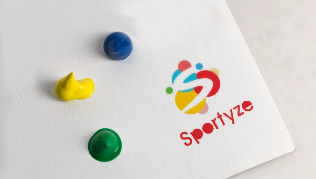
- Thoughtfully we explored and came across various font ideas that were more rounded without any kind of edges or sharpness so that the idea can be reflected that it's an institution for toddlers.
- We added many colors to the brand as kids’ jolly behavior is reflected by the spectra of different colors. Also, when we talk about kids’ domains and brands they prefer more colors let's take the example of kid’s brands like firstcry, beebay, bachpan, petals, early years, makoons, etc.
- Challenges cannot be alone tackled by font and color choices, it requires shapes that do not include sharpness but rather require a blunt one. In order to fulfill this requirement, we added 3 circles to the logo that imparted the feeling of softness and considered the name “Sportyze”. We added colors to the shapes rather than in fonts.
- Our team didn’t bring many of the changes in the color of the name “Sportyze”, so the readability persists.
- We as a team do not belong to the school of thought that believes in creating taglines for brands. But as the brand identity was not enough to describe the brand ideology we pondered and thought of creating a tagline. The solution was very instant which we suggested over a few cups of coffee and we came up with the tagline “Shaping kids physically, so mentally” which suggested the idea that Sportyze shapes a kid in terms of physical strength as well as mental strength. We brought this tagline so that we can express the sentiments of the institution in fewer words.
Sportyze team appreciated the solutions brought up by Saarthi and they were convinced and operated upon them by working on touchpoints of branding that included billboards, social media handles, prospectus, stationary, etc, which resulted in the increase of the brand value of Sportyze. Even after the time COVID-19 lockdown, when the travel industry and schools had a big hit leading to their decline, Sportyze had a triumph over its arena as it got investors, and funding raised and opened up a branch in Noida and Gurugram. Eventually, the people were aware of the idea that Sportyze from the very beginning wanted to convey.
Our design choices were highly applauded by our client and they admitted that it was now relatively easier to make the target audience what they meant. All the brand visual identities whether we consider the font, colors, or shapes, were all at the utmost perfection in imparting the brand values and were highly recognized. The tagline was a strategic call though, in the absence of representatives, it imparted the correct value of Sportyze because of the three magical words which are Kids, physically, and mentally. These words were huge helping hands in establishing the correct position of Sportyze in the audience’s mind.